I knew I also wanted an icon to accompany the text, but slitting my attention between helping to run business, graphic design, and washing cars genuinely over-encumbered me. I hired a Conway Fillies to create icon, as I worked on the main poster we’d use to market our business.
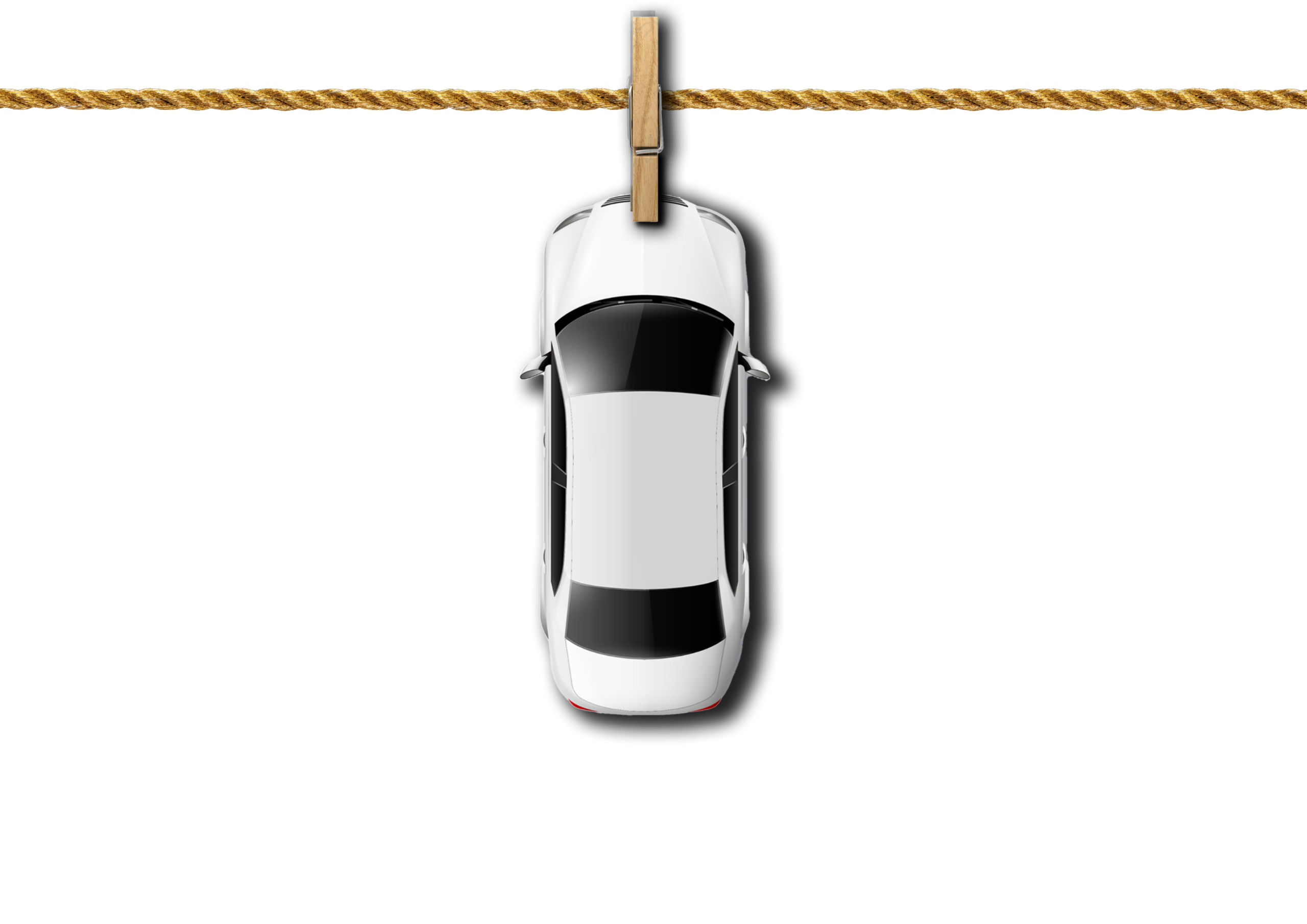
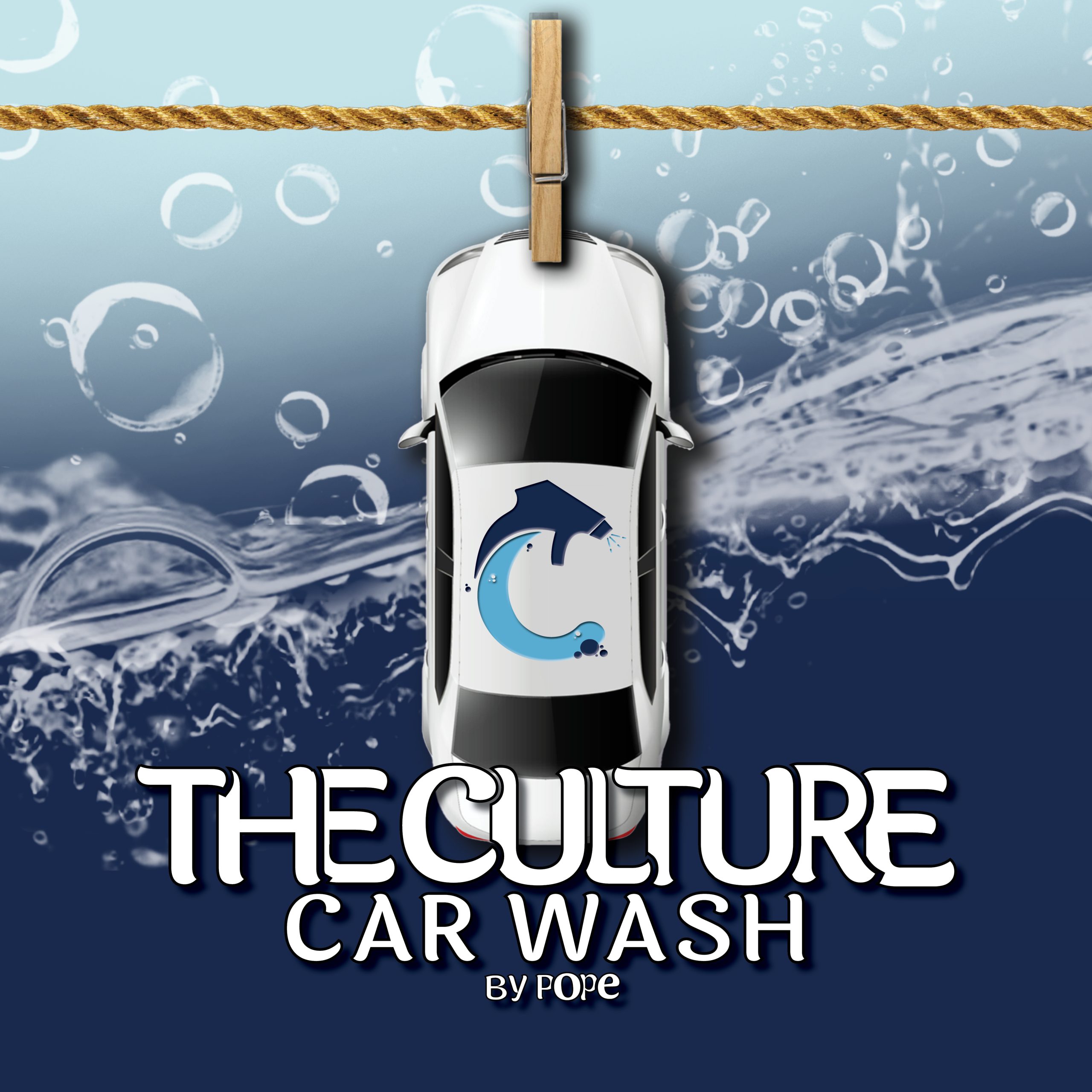
One of the 1st things that came to mind when I sat down to “build” this brand was a car on a washing line. For some reason I didn’t think made a good logo (hindsight is defiantly 20|20) I didn’t know how it would translate to the various mediums we had planned.
We pivoted to a text-based logo featuring the “By Pope” tag, offering a subtle and respectful tribute to the individual we had originally intended to name the car wash after.
I knew I also wanted an icon to accompany the text, but slitting my attention between helping to run business, graphic design, and washing cars genuinely over-encumbered me. I hired a Conway Fillies to create icon, as I worked on the main poster we’d use to market our business.
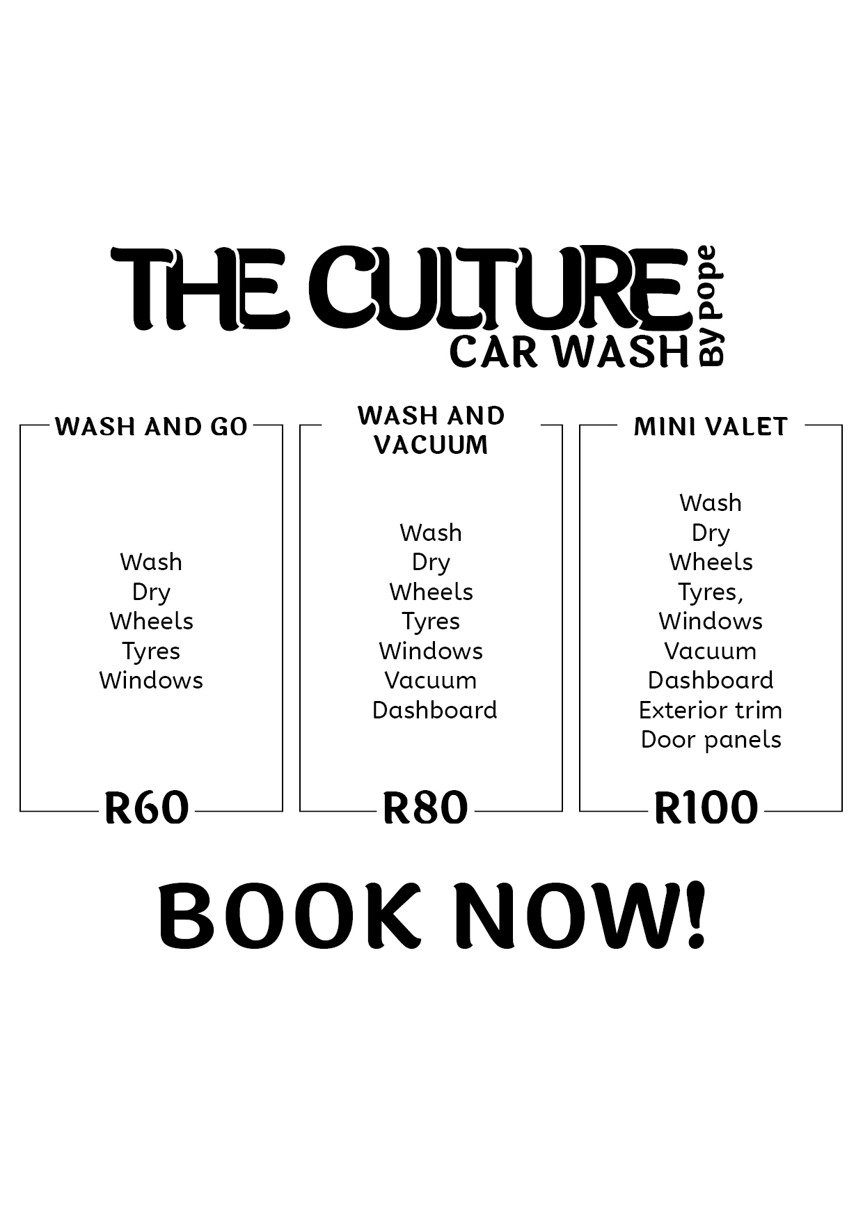
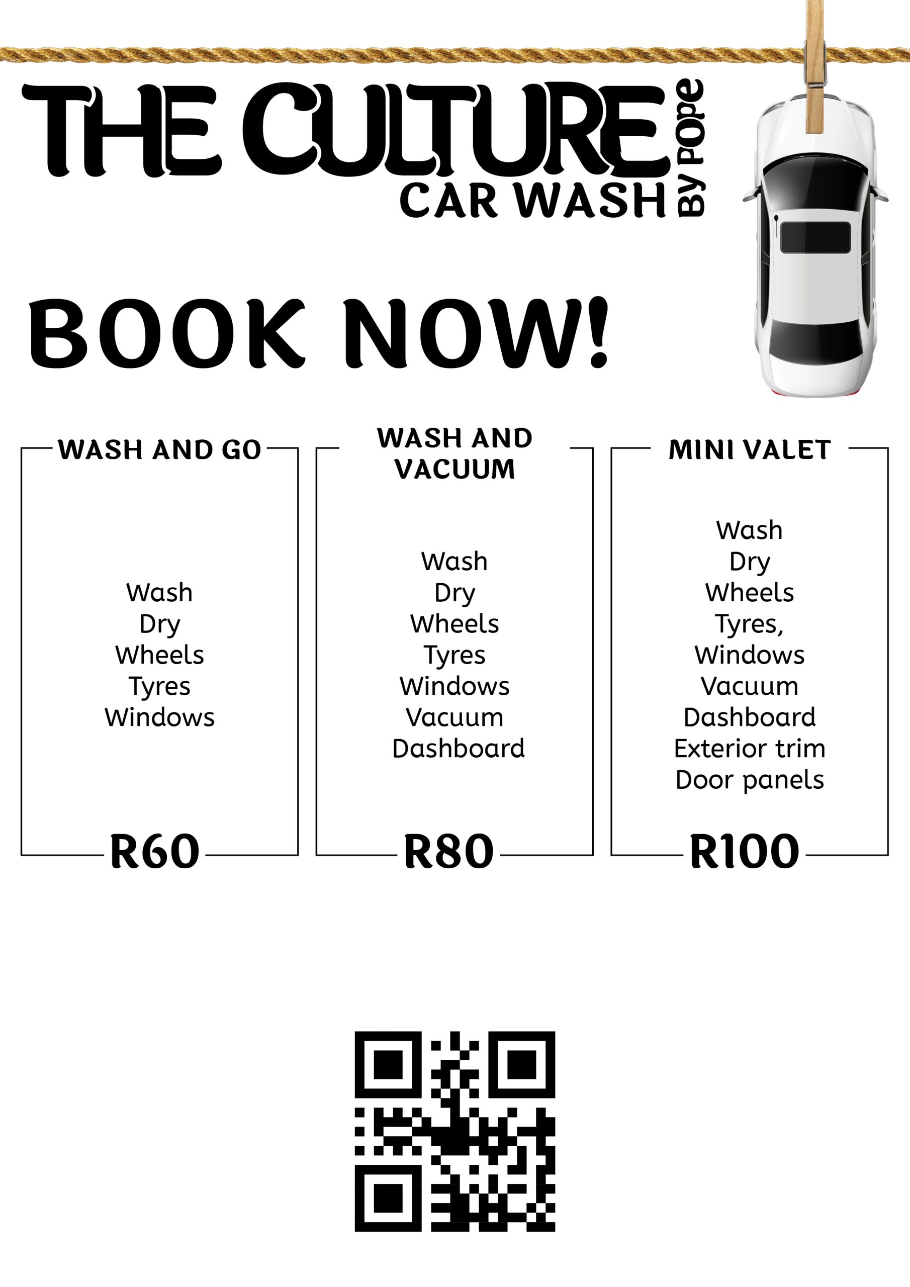
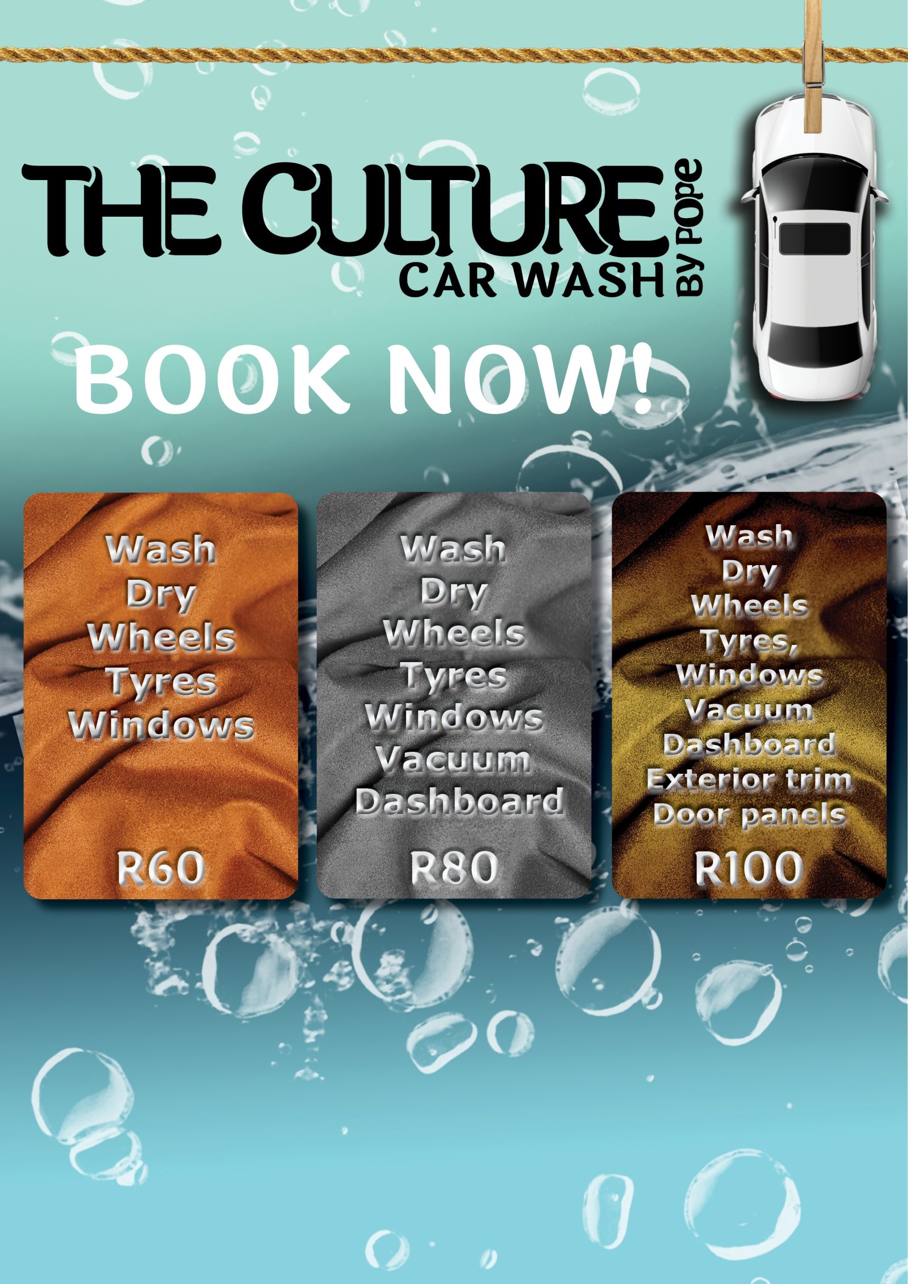
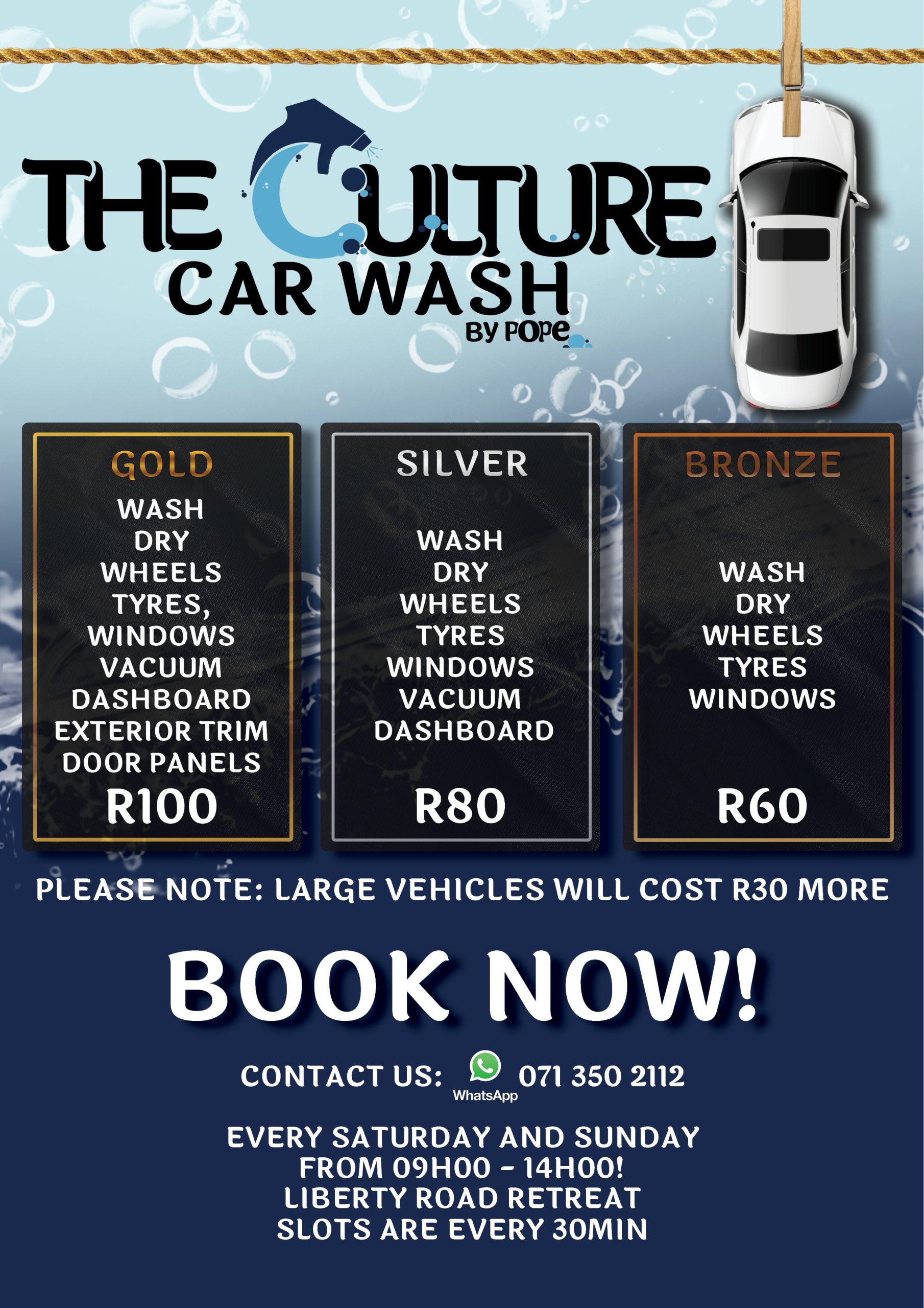
Knowing the volume of information needed for the poster my primary focus was fitting all this information in a manner that was legible and divided the various packages we offered.
Next I wanted to add visual interest, and a means to easily differentiate the various packages
I really took a liking, to dividing the packages using the different metals. So I worked on “perfecting” these elements.
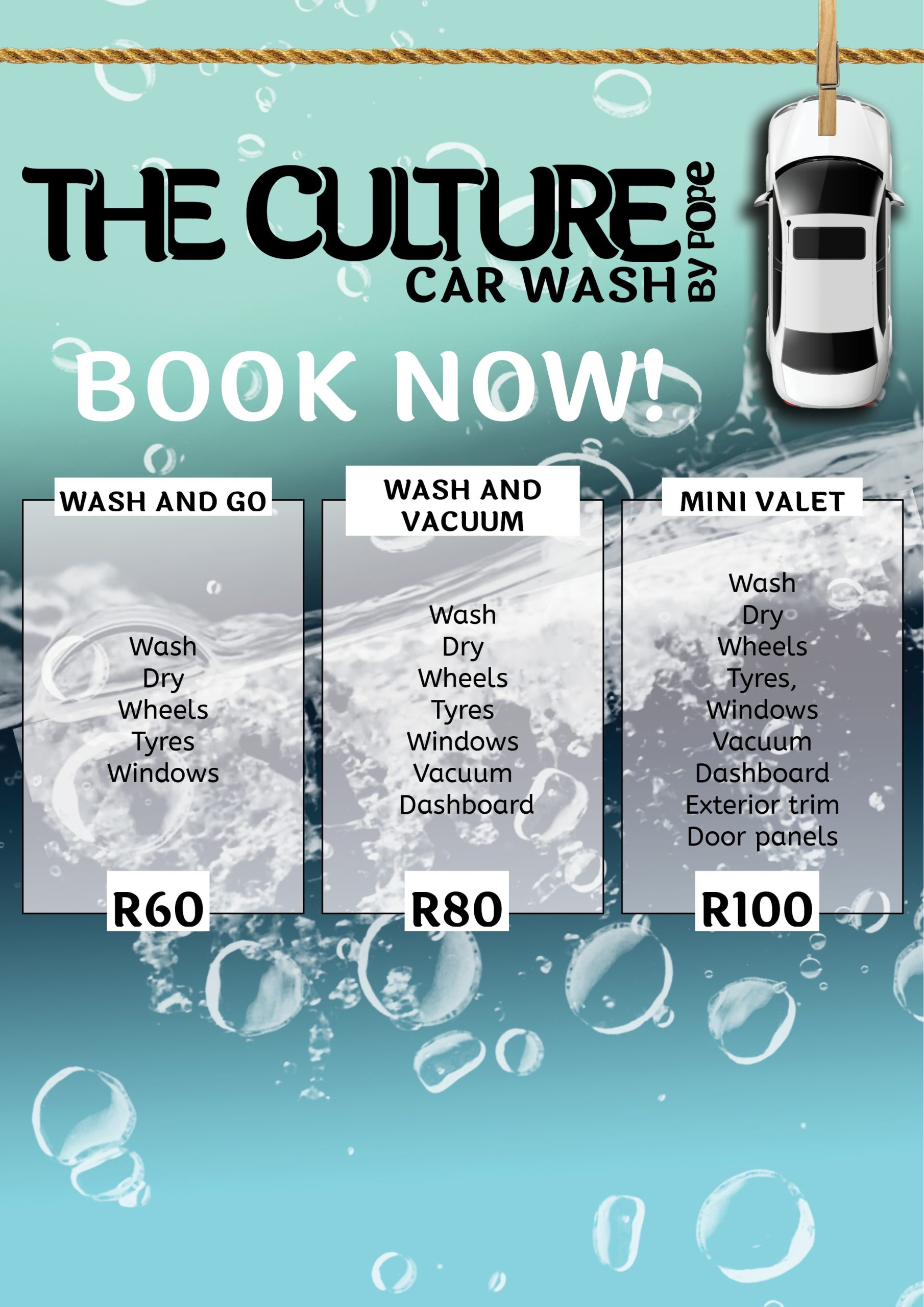
These new elements didn’t fit the overall poster aesthetic, so I had to update the background to fit the new aesthetic.
Having received the logo icon from Conway. The Next task was to figure out the logo. I asked him for a greyscale logo, as I didn’t have a clear plan for the brand’s colours; I bet you can tell what inspired the logo’s colour.
The final poster design became a brand guide, of sorts. I am proud of the final poster. This was also one of the 1st times I didn’t build every element myself and I believe sharing the responsibility really allowed me to focus on other elements like fitting all the information onto the post which was probably the biggest challenge of the whole project.
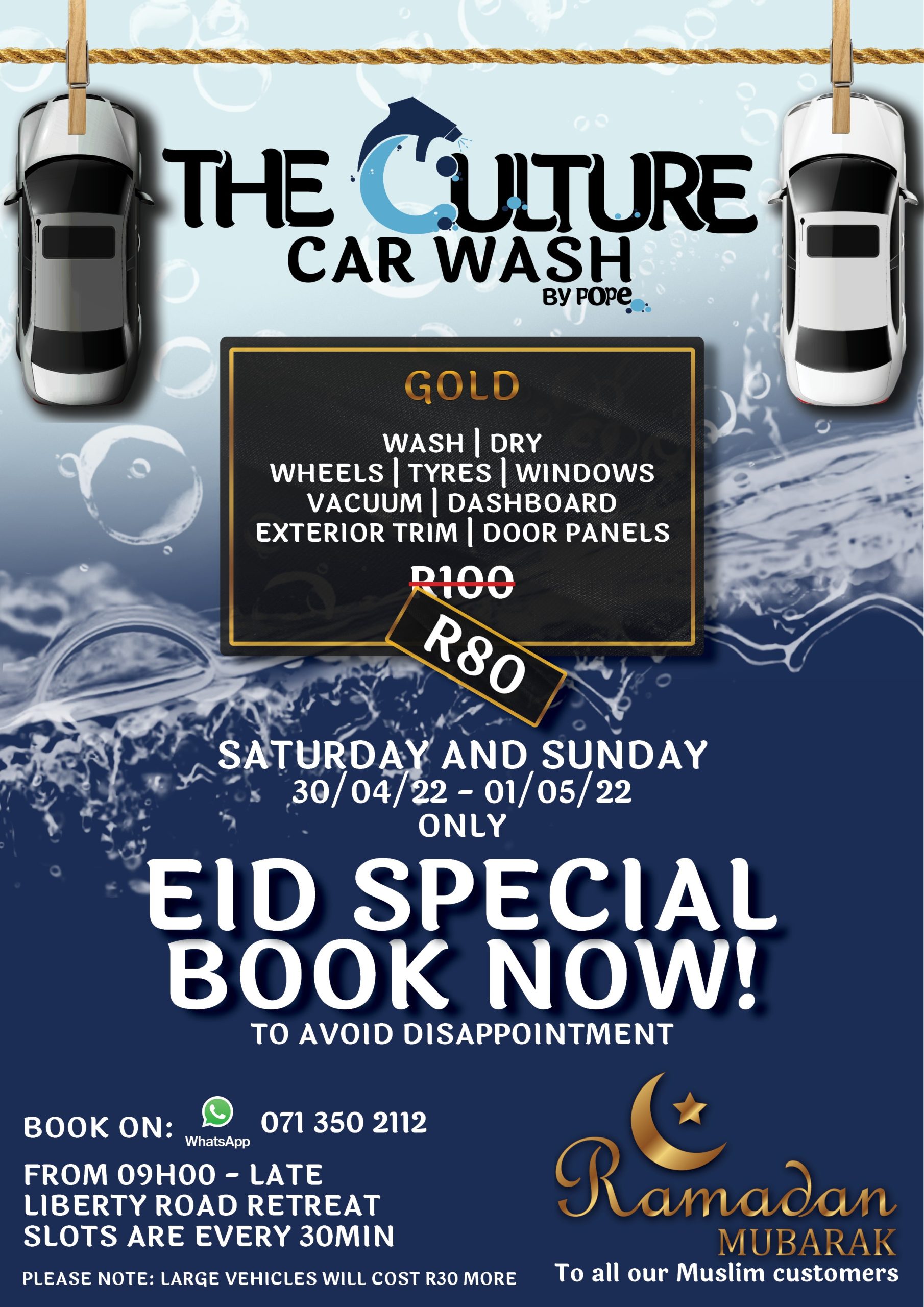
Below are poster variations and various marketing assets I had developed for the brand.